Dead south
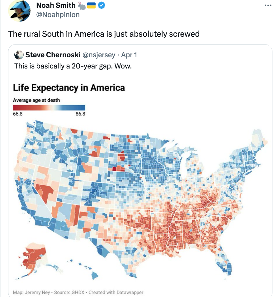
This tweet caught my eye:

So what explains this pattern? I presume there are lots of factors. The orange parts of South Dakota and Arizona are Indian reservations The blue along the Tex/Mex border reflects the long life expectancy of Hispanics. Hawaii has a heavily Asian population. Both groups contribute to California. Seattle and Denver have well educated people who like hiking. Etc., etc.
But what about the South? Some of it is race. Blacks have a shorter life expectancy than other groups. But not all; Tennessee and New York are both roughly 16% black. The South really does have a shorter life expectancy, at least in rural areas and smaller towns.
I grew up in Wisconsin, and thought I knew the state pretty well. But I couldn’t tell you why it looks bluer than Indiana. And before looking at this graph, I would not have expected such a vast different between Nebraska and Oklahoma (both boring flat states out on the Great Plains.)
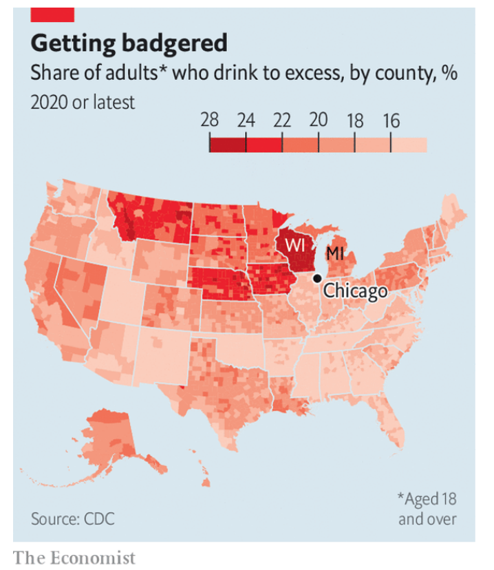
Last time I checked, Wisconsinites drank more alcohol than any other Americans. That doesn’t seem healthy! When I visit, the people look obese. (It’s actually average, but my reference is relatively skinny Massachusetts/California.) So why is Wisconsin blue? Indeed other than those Indian reservations, the entire Nebraska/North Dakota/Wisconsin triangle looks pretty blue. Why? Why is Wisconsin bluer than Michigan counties with similar demographics?
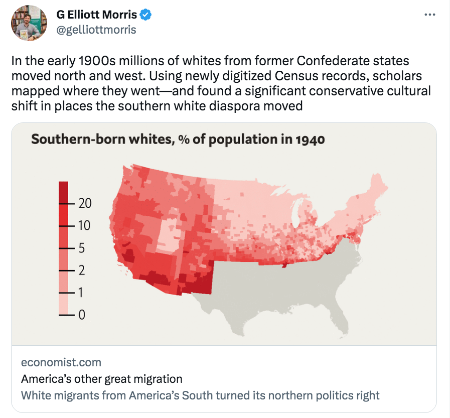
Oddly, that triangle of longevity maps almost perfectly with another map showing places where white southerners did not move:

Longevity is obviously lower in the south, and (more subtly) seems a bit lower in parts of the north with lots of immigration from the south.
PS. The map shows white southern migration, but lots of blacks also migrated from the south, albeit mostly to northern industrial cities. They also tend to have a lower life expectancy.
Update: The graph below shows that Wisconsin drinking is in another league. When I was growing up, I assumed our drinking culture was normal, like everywhere else.

Tags:


4. April 2023 at 09:15
Obesity related health issues.
4. April 2023 at 09:17
https://www.cdc.gov/obesity/data/prevalence-maps.html
4. April 2023 at 10:04
Scott, have you read “Albion’s Seed” by David Hackett Fischer? It’s 35 years old but still relevant!
Its central argument is: there were four waves of immigration from England in the 17th century which shaped the cultures of four American regions at their outset, and the differences persist today. The settlers in tidewater Virginia and in the Appalachian backcountry had unique culture that correlated with lower life expectancy at the time – and still does today.
4. April 2023 at 10:35
I think this correlates almost perfectly with obesity maps. I can’t speak to the accuracy of your map or this one, but here is one county-level one I found online https://www.maxmasnick.com/media/2011-11-15-obesity_map/obesity_by_county_large.png
4. April 2023 at 11:56
Tom and Carter, Yes, that’s part of it, but not all. Wisconsin has plenty of drinking and obesity. Nebraska’s as obese as Indiana. Maybe less opioids?
Stoneybatter, Yes, I knew about the Appalachian region, but I’m surprised by differences within the Midwest.
4. April 2023 at 12:42
Count on Scottt to give publicity to Noah Smith’s nauseatingly self-righteous “commiseration” for a region he loathes for political reasons.
Does Noah ever have anything to say about the massive out-migration of millions and millions of people form urban counties in CA, NY, IL that he considers to be beacons of progress?
Does Scott consider that perhaps the data in the chart do not distinguish between a person who is born in GA and dies in GA and someone else who is born in NY, but dies in NY?
If it doesn’t, as I strongly suspect, the data’s utility is marginal. Certainly not sufficient for Noah’s sweeping conclusion.
Given that, by my calculations, less than HS educated people are more likely to flee CA, NY and IL than anyone else, a key way they may be increasing their appearance of “health” is by driving out poor people.
That’s probably okay with a phony liberal like Noah. I would expect a little better of Scott.
4. April 2023 at 12:44
Correction. My third paragraph should above end “dies in GA.” Of course. Otherwise it’s obvious nonsense.
4. April 2023 at 13:17
@Scott,
I agree obesity isnt all of it. But to your point, obesity & race I would imagine account for the vast majority of what is seen.
4. April 2023 at 13:25
Stan, I can’t speak for Noah Smith, but you are reading things into my post that are simply not there. I’m not making any normative judgments at all. I’m not even sure a longer life expectancy is better—maybe it’s best to live to the fullest and die younger. I like ice cream!
Tom, Yes, that seems reasonable. And how much of race is obesity?
4. April 2023 at 15:11
@Scott
That’s a good question actually. I would imagine that obesity is likely the dominant factor by far and that a portion of the race differential in life expectancy is due to obesity.
I am sure there is a lot of variables at play here: Cultural differences, average income, lifestyle, access to health care, personal choices.
But I would say, you would be hard pressed to find a map of any singular variable, like obesity rate, that mirrors the life expectancy chart above.
4. April 2023 at 16:11
It’s entirely race. Here’s the black population circa 2000:
https://2.bp.blogspot.com/_r-oXOVrWkyE/TP_5JJ7VNpI/AAAAAAAAACo/L8dCO5gP7Yw/s1600/Black+Population+2.jpg
Just add Native Americans and it’s almost a perfect match. Some counties are one map bracket off. That’s because the black population is barely into the light blue bracket on the Census map.
Straussian explanation: According to Wikipedia,’In 2005, the Atlanta Journal-Constitution ranked “Statesboro Blues” number 57 on its list of “100 Songs of the South”.’
4. April 2023 at 17:41
I suspect WI has something to do with access to healthcare. The dark blue counties are all part of medical systems. The western counties get their care in Minnesota, including specialists from the Twin Cities or Mayo who visit them. The Marshfield system has very good care for the northern rural areas (recently experienced with my in laws).
4. April 2023 at 23:19
Scott,
That first map is another great addition to my game of “can you spot Williamson county, TN?” which is the county I’m from (fyi, you absolutely can). It makes me wonder if one could isolate the distinctive characteristics within Williamson that don’t exist in other suburban greater Nashville counties that explain the high life expectancy. My guess is a lack of rural farming economics and a surplus of professional class jobs (and a distinct desire to refuse anyone who doesn’t fit that bill admission via home prices).
4. April 2023 at 23:59
Again, your concern with population size, and death rates in particular areas, is nothing short of disturbing. The very fact that you concern yourself with other people’s eating and drinking habits, whether it’s drinking vast amounts of alcohol or the love of Southern BBQ meat, is grotesque. It has “I’m a totalitarian thug” written all over it.
You are what T.Sowell calls a busybody.
You concern yourself with trivial things that have absolutely no bearing on economic progress, and which if pursued to the extent you wish to pursue it would lead to unimaginable tyranny.
5. April 2023 at 06:55
+1 for the obesity map.
Here’s a US map of Tobacco use that correlates reasonably well. Interestingly, the anomalous Wisconsin county on the age-at-death map is also a stand out on this tobacco use map:
https://www.wkyufm.org/health/2017-11-06/tobaccos-toll-new-push-to-stop-smoking-in-countrys-sickest-states
(scroll down about half-way through the article too see the map)
Here’s income:
https://www.reddit.com/r/MapPorn/comments/202sit/median_household_income_by_us_county_1600_x_950/
So, Joan Rivers was right – you can never be too rich or too thin.
5. April 2023 at 08:07
Your chart seems way off——Check out the CDC ——-“Life expectancy at Birth by State”
Below lists states by alphabetical order——perhaps people move to certain states to die? -:). Something is wrong here.
Data Table
Datatable showing data for the United States Map figure.
LocationSort by location in no order
Life ExpectancySort by life expectancy in no order
Alabama
73.2
Alaska
76.6
Arizona
76.3
Arkansas
73.8
California
79.0
Colorado
78.3
Connecticut
78.4
Delaware
76.7
Florida
77.5
Georgia
75.6
Hawaii
80.7
Idaho
78.4
Illinois
76.8
Indiana
75.0
Iowa
77.5
Kansas
76.4
Kentucky
73.5
Louisiana
73.1
Maine
77.8
Maryland
76.8
Massachusetts
79.0
Michigan
76.0
Minnesota
79.1
Mississippi
71.9
Missouri
75.1
Montana
76.8
Nebraska
77.7
Nevada
76.3
New Hampshire
79.0
New Jersey
77.5
New Mexico
74.5
New York
77.7
North Carolina
76.1
North Dakota
76.9
Ohio
75.3
Oklahoma
74.1
Oregon
78.8
Pennsylvania
76.8
Rhode Island
78.2
South Carolina
74.8
South Dakota
76.7
Tennessee
73.8
Texas
76.5
Utah
78.6
Vermont
78.8
Virginia
77.6
Washington
79.2
West Virginia
72.8
Wisconsin
77.7
Wyoming
76.3
AL
AK
AZ
AR
CA
CO
CT
DE
FL
GA
HI
ID
IL
IN
IA
KS
KY
LA
ME
MD
MA
MI
MN
MS
MO
MT
NE
NV
NH
NJ
NM
NY
NC
ND
OH
OK
OR
PA
RI
SC
SD
TN
TX
UT
VT
VA
WA
WV
WI
WY
5. April 2023 at 08:14
Scott, I think it is pretty obvious Noah Smith was obnoxiously making a normative judgment. I will take your word that you weren’t. But the fact that U.S. Census data on mortality in different regions look only at the place of death, and not at the place of death, is still a major problem with the data cited by Smith that your original analysis overlooked. How do you know how high the life expectancy for people born in WI is if a huge share of them that is probably not demographically identical to or even very similar to the share who stay move south a long time or a shor time before they die? You don’t.
5. April 2023 at 08:15
Did it again. Second sentence should read, in part “look only at the place of death, and not at the place of birth”
5. April 2023 at 08:18
Kangaroo, You said:
“It’s entirely race.”
No, not even close. Did you even read the post?
Sara, You are contesting Ricardo for the title of most clueless commenter. How can you spend years reading my blog and know NOTHING of my actual opinions?
Captain, That Wisconsin county is an Indian reservation.
5. April 2023 at 16:17
Stan, If you had followed my blog over the years, you’d know that I place little value on living a long life. Once I argued that young men who live wild reckless lives produce positive externalities, despite dying younger.
Yes, migration probably plays some role, boosting the figures for Florida and Arizona, for instance. But I doubt it affects the comparison between say Nebraska and Oklahoma.
6. April 2023 at 07:12
I have followed your blog for many years, and it seems to me you have been on both sides of the map with regard to longevity tradeoffs.
During COVID, as we recently discussed, you labeled Australia and New Zealand as pandemic policy “successes.” A reasonable person would understand that to mean that, if it results a somewhat longer lifespan for over 65’s, it’s okay to keep the whole country locked inside for weeks or months at a time. That is, after all, bascially what Australia and New Zealand did to “fight” COVID.
6. April 2023 at 07:52
Stan, You said:
“it’s okay to keep the whole country locked inside for weeks or months at a time. That is, after all, basically what Australia and New Zealand did to “fight” COVID.”
Is that true? If so, then I was not well informed. I read numerous articles claiming that people in Australia and New Zealand had much more normal lives than Americans during Covid.
I have never supported Covid “lockdowns”.
Also keep in mind that these things can change over time. In late 2020 and 2021, the Chinese people were much less restricted by Covid than Americans. By 2022 they were far more restricted.
6. April 2023 at 20:17
Fairly certain that map is also the same map for almost any other social dynamic in America. Reddit actually did a thing on it.
I’m guessing you already saw the map where it’s basically the identical map for lower alcohol consumption. Basically every place that lives longer has far more alcoholism. And I think most intelligent people don’t believe alcohol improves health anymore and it’s just confounding factors.
7. April 2023 at 16:42
Scott:
I did read the post. But when I look at the black population (BP) map, mentally overlay the native population map and compare it to the life expectancy (LE) map, they seem to match very well, with only a few significant exceptions. The big upshot is that there is virtually nowhere in the US with a high black population *and* a high life expectancy.
Your point that the high life expectancy of Hispanics influenced the LE map made sense to me but comparing the LE map to the Hispanic population map linked below, there doesn’t seem to be much support for it. Some areas with high Hispanic populations have high LE, others have only moderate or even low LE. Southern Texas is >90% Hispanic but has mostly mid-range life expectancy. The counties in WA state with Hispanic pop don’t correspond well to those with high life expectancy. Overall, there doesn’t appear to be a strong consistent influence from the Hispanic population.
On the LE map Wisconsin is more blue than Indiana, as you said, but the pop maps show a higher black population in Indiana, which has probably 20 counties that are over 5% black vs. maybe 5 in Wisconsin. You note in your post that Seattle and Denver people like to hike, but both have very low black populations. Only two counties in all of WA are >5% black. All orange counties in WA have large native populations. In NE WA is the Colville rez, the birthplace of Sherman Alexy; and the light colors on the coast also reflect high native populations from the Hoh, Queets, Quinalt, Makah and others. The same can be said for the orange
But as I said above I noticed two major exceptions to the high LE / low black population trend when looking at the maps more closely to respond to your comment. First, there is a belt through West Virginia, eastern Kentucky, and Tennessee with low black population and very low life expectancy. The other is the only place on the map that I noticed with high black population *and* high life expectancy: SE Florida.
IN various places there are individual counties that buck the trend, but the larger trend is pretty clear.
Hispanic population by county 2017:
https://www.vividmaps.com/wp-content/uploads/2018/10/Hispanic2017.jpg
8. April 2023 at 08:55
Kangaroo, Clearly blacks have a shorter life expectancy than whites, while Hispanics have a longer life expectancy. But I’m more interested in the major regional differences within a given race.
10. April 2023 at 10:16
Not sure if you are still reading the replies, but here are my thoughts:
I have to believe that diet and exercise opportunities make a huge difference, even independent of obesity and race.
For example, a subway shop on every street corner in Nebraska isn’t as bad as a BBQ Rib shop in every strip mall in Oklahoma. Look at sodium and cured meats as a culprit.
I’d also look to density of sidewalks and public parks. I suspect Nebraska and Wisconsin invest in these things more heavily than the South. Plus the weather is more hospitable for exercise when the dew point isn’t 80 degrees and there aren’t swarms of critters attacking you.
10. April 2023 at 10:20
Oh, and it’s not that Latinos have innately long life expectancies.
It’s that beans and rice are a pretty healthy diet, all else being equal. Even if you are obese.
10. April 2023 at 10:50
Steve, Agree on exercise and diet. BTW, it’s the beans, not the rice.